We’ve talked about basic tenets of online ordering menu management. We’re kicking off a mini-series for the activities online that surround your customers’ online ordering experience. No matter how locked in your online ordering menu might be, if the activities surrounding it aren’t equally locked in, I’m setting you up for success. In this issue we’ll talk about where your online ordering should live on your website and some data to support that structure. Check out our YouTube video here.
75% of restaurant website traffic is to order food.
That means that the NUMBER ONE reason that someone is on your website is to order food. This means that the number one goal of your website is to get customers to your online ordering menu with as little friction as possible.
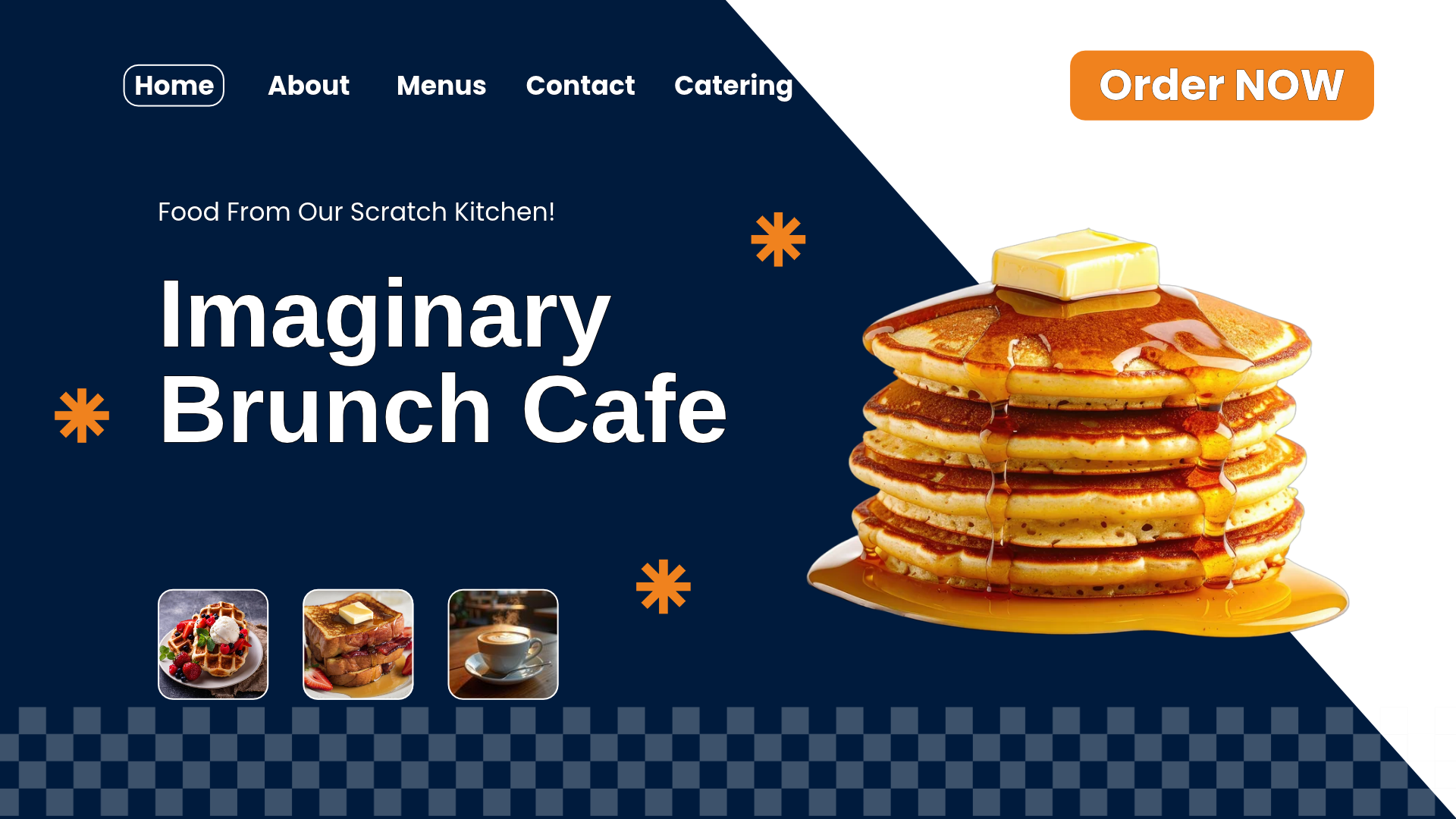
Make sure that the call to action for ordering food is obvious. Most people expect the button to be in the upper right-hand corner of the website so that’s the best place to put it. Consider making it even more obvious by making it a different color and maybe a different shape (like the shape of an animal for bbq, a scoop for ice-cream, or a carton of french fries for a burger place).
One thing worth mentioning: This doesn’t mean that TO GO is the number one reason that people are on your website. This also means catering. Catering should be treated the same way: As a priority that is easy to find on your website. While it’s also your website’s #1 priority, it should be treated as a separate but equally important piece. We’ll talk a little more about it in our next newsletter and, one day, we’ll dedicate an entire newsletter to catering.
Pro Tip: Use a contrast checker to make sure that your call to action is ADA compliant and easy to read.
60% of online orders are done via mobile devices.
It’s important to build your website and online ordering menu to be optimized for mobile orders. Whenever you make changes to your menu, make sure that you verify that it looks and functions well via mobile. It’s very important that you test this on actual devices; Android and Apple phones. There might be a functionality that looks fine on a desktop, when you shrink the screen, but it might actually function differently on the actual devices.
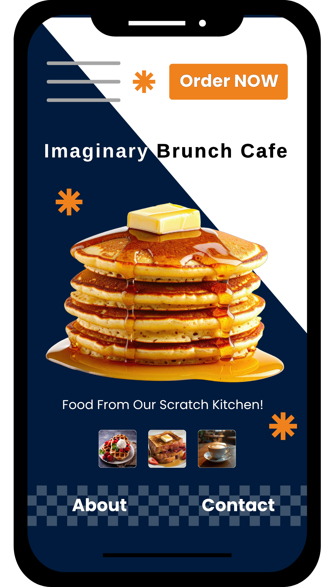
Make sure, also, that your mobile home page is streamlined and clear of clutter. Be careful of pop up boxes. The size or placement might make it hard to click out or impede functionality, leading to abandonment.
I recently ordered from a breakfast restaurant on their mobile website. When I added items to the basket, a popup box notified me that it’d added that item to my basket. It was a permanent popup box that needed to be X’d out in order to be removed. It didn’t just go away after a few seconds. Not a big deal normally but after two or three changes, it became tiresome. So I ignored it. Then it came time to check out. I couldn’t find the basket anywhere. It took me far too long to realize that I needed to “X” out of the notification box to get to the basket. I don’t want to say that I’m smarter than the average bear, but if I have issues with how an ordering site functions, I assume that there’s a good chance that other people will too. If I have trouble, I aim to fix it for those other 5 or 6 people who might have similar issues.
Too Many Decisions Means Your Customers Go Get Pizza.
Reducing the number of clicks to get TO your menu is important. People are hungry and they just want to order food. Let them do that and then you can ask all of the things. Imagine that each and every decision you ask your customer to make incrementally reduces the likelihood that your customer will complete their order. Act accordingly.
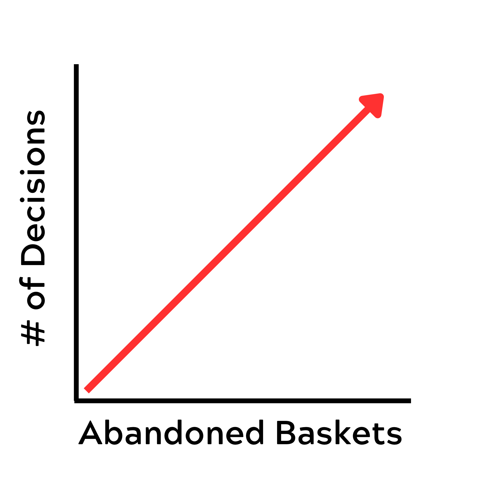
People have a secret, internal, unmeasurable threshold. This threshold is their pizza threshold. How many decisions do we ask them before they just go order pizza instead? There’s no way for you to know what this threshold is, and it changes day by day, person by person. It’s unfair for you to have to accommodate this secret internal threshold, but, if you want to complete orders, you must keep it in mind.
This threshold is called "Analysis Paralysis” or “Decision Fatigue”. When someone reaches this point, they can’t make any more decisions. If they’re in the middle of an order on your site, they will abandon that basket and go order somewhere else.
That means you need to be mindful of how many questions you ask a customer to answer before you show them the menu or let them order. Ask yourself: Do we need to know this information before we can start an order? Is there any way that we can hold off on answering this question until the customer gets to checkout?
Are we being data goblins?
Your quest for data should not overshadow the importance of completing orders. It will be hard to spin the data to leadership when something you do causes an immediate 5% increase in your abandonment rate. If you need data before you show people the menu, make sure you have a solid argument as to why. If you’re just collecting data with no clear path to use it, you’re a data goblin. Don’t collect data if you’re not planning on using it because it might come in handy “someday”.
In our next issue we’ll talk about questions you might ask before you let a customer see your online ordering menus and what you might consider instead. Customers are willing to put up with more transgressions as they’re checking out. Use that to your advantage.
What do you think? Do you disagree? Is there something you’d like a deeper dive into? Anything else you’re eager to talk about? Let me know in the comments!
If you haven’t already, please sign up for this newsletter either on our website or on LinkedIn.
If you love all of this stuff but don’t have the bandwidth to do this with your brand, let’s chat. This is what I do and I’d love to work with you. Schedule a FREE 30-minute consultation, here.
Thanks for your time today! I look forward to Making Good Lemonade with you again soon.